Web Design trends to follow in 2024
March 1, 2024
Aleksandra Tulibacka, EDA Jury, Poland, Trends, Web Design
In the dynamically changing world of website design, trends evolve at an incredible pace. In this article, we will look at the most important trends and directions that, in my opinion, will dominate the landscape of website design in 2024.
From AI-generated illustrations, through designer chaos, to minimalist typography and unusual color combinations – this is what awaits us in the coming year.
AI-generated illustrations
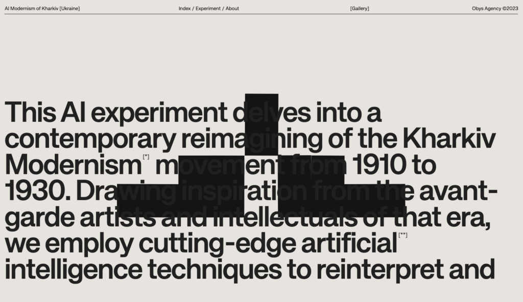
I long resisted recognizing AI as a trend in design, seeing it more as a tool. Nevertheless, it’s hard to deny that it significantly changes our approach to work and design.
I recently wrote about how illustrations (and illustrators) are increasingly confidently entering the world of websites, offering their services as a new quality and a great alternative to stock graphics. Unfortunately, their place may slowly be taken by generative graphics, more precisely illustrations created using this type of tools.
The style of these illustrations will certainly be diverse. From classic illustrations, through hand-drawn doodles, to crazy, photorealistic or gaming graphics, but we will surely see and hear about them more than once.
The coming year promises to be extremely exciting, mainly due to the increasingly rapid development of technologies that improve our work. Three key aspects that will gain even more importance are: AI, minimalism, and microinteractions.
AI will certainly play a big role in the coming year – whether we want it or not. Although 2023 was revolutionary in this respect, the coming year will be a time for development and refinement of technology and its conscious use by designers.
Adobe Firefly will greatly facilitate the creation of product photos. AI in Figma will streamline website design, and artificial intelligence in Webflow will make it easier to implement more advanced sites, using, among others, JavaScript. AI will definitely change our work, and those of us who will be able to quickly adapt and consciously use new solutions will benefit.
Another aspect is minimalism and sustainable design, placing more emphasis on UX than UI, i.e., focusing on the overall user experience with the product or service, not just its appearance. In practice, this means designing with ease of use, intuitiveness, and user satisfaction in mind.
The last element, which complements the previous one, is microinteractions. Overloading pages with flashy animations will give way to more refined microinteractions, increasing engagement and usability of pages, which will translate into user experiences.
In conclusion, pragmatism combined with new technologies will become key in our work.
Mateusz Pałka, Symbol Studio
Designer chaos
One of the trends, which partly results from the availability of current tools, is design and implementation using no-code technology.
Tools such as Webflow or Framer are becoming increasingly popular, allowing designers to implement websites faster and more independently. Thanks to the possibility of independent website creation, designers have more freedom.
Creators, who are “liberated” from the restrictions imposed by programmers, are likely to start creating more unusual compositions.
For CMS-based sites, achieving a controlled chaos effect, especially in layouts and photo+text connections, is a challenge. This is especially difficult when it comes to predicting all possible scenarios. In no-code technology, this problem is usually absent, as static sites are based on data that is available at the time of creation and probably will not need to be changed.
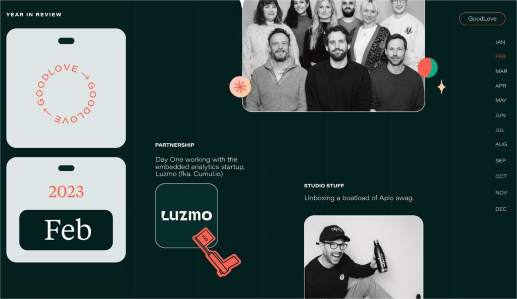
On the goodlove.co site, information is presented adjusted to its length – sometimes we have larger, sometimes smaller photos, to which different text widths are matched.
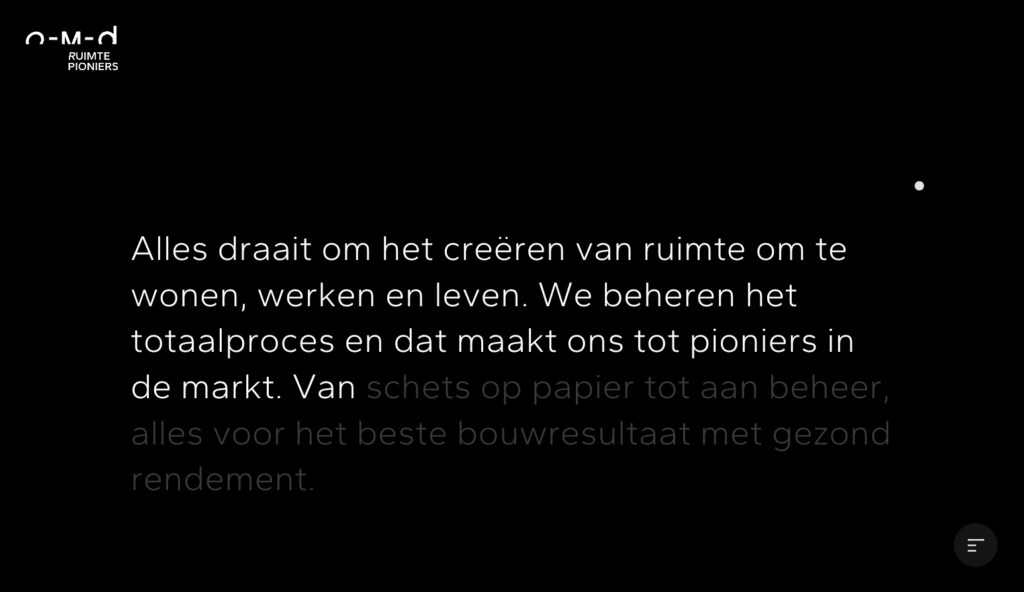
On the O-M-D site, created using no-code tools, two interesting effects were used – text coloring by word reacting to scrolling and dynamic change of content scrolling direction. Both techniques are often found on sites created using this type of tools.
Single-element, sans-serif typography as a decoration
We have recently observed a strong return to the trend of using simple neo-grotesque fonts (Helvetica, Arial or the recently popular Inter) in projects. This time, however, they are not used only for longer texts or simple headers, but rather serve as a form of decoration – the main graphic content, not just an addition to another decorative element.
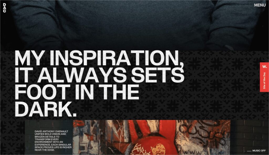
David Chenault’s website, rich in graphic elements, was supplemented with simple typography. Despite its simplicity, thanks to the large amount of text written in uppercase, it serves a decorative function.
This stylistic approach appeals to designers and fits perfectly with design sites, especially in the modernist trend. An example is a site where humanistic typography was used. Thanks to the use of large differences in text size and a layout inspired by a grid, the whole thing looks very interesting.
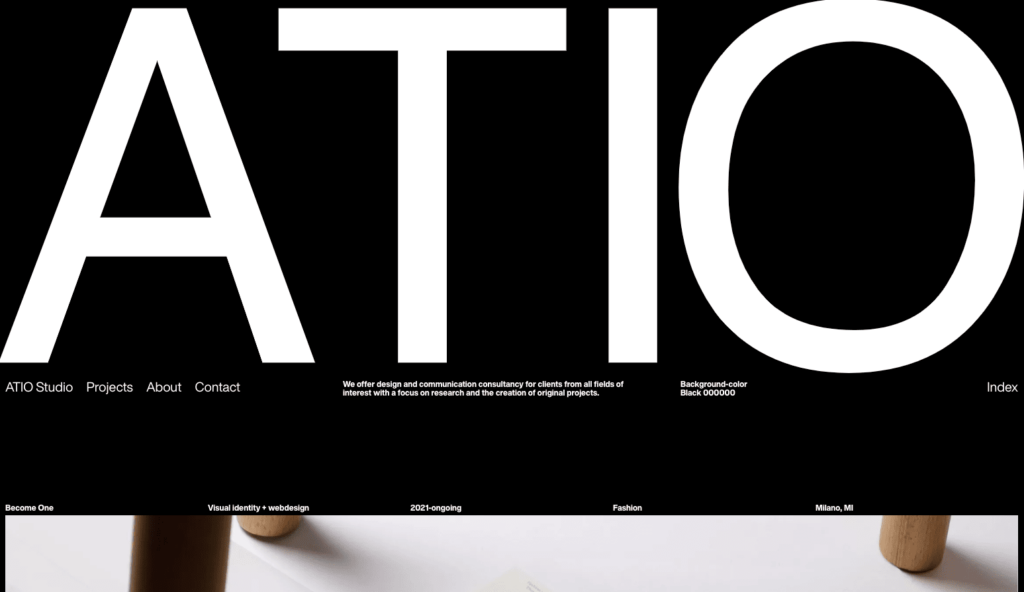
ATIO studio took this approach to a higher level, creating a subpage with a list of their projects based on project names written in uppercase and a simple font. The designers also play with large contrasts in font sizes and negative space.
This idea is not only a solution for designer sites and artistic projects. It also works very well for minimalist and slightly more template-like sites.
Maximalism
In short, overload is a style that involves providing the recipient with the maximum amount of stimuli. In the case of websites, this is not my favorite method, because in a world of flashing pictures we usually need more peace. Nevertheless, it’s hard to deny that more and more brands (especially those dedicated to a younger audience) are deciding to design in this direction.
Maximalism is not only a multitude of elements, but also general graphic overload, which the nerdo.tv site definitely does not lack. The use of uppercase, which practically scream at us from the screen, combined with bright, primary colors and flashing, moving elements, makes a lot happen on the site.

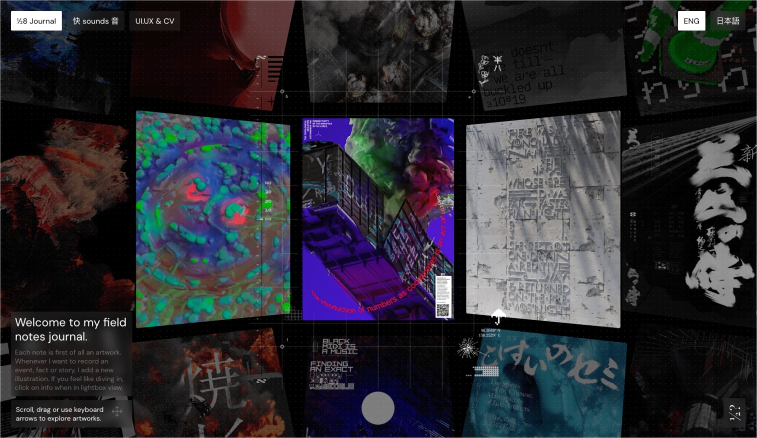
Another example of maximalism is the photo diary of a graphic designer. On the main page, we are greeted by rich compositions of moving thumbnails placed under a map-inspired overlay. Additionally, all elements of the site have been covered with a delicate dotted pattern, which adds a bit of visual confusion.
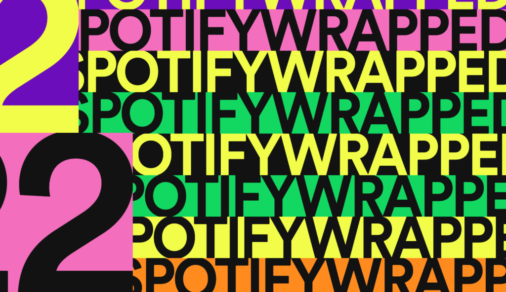
To some extent, last year’s Spotify Wrapped was also maximalist. Intense colors, gigantic typography fitted to the screen, and a multitude of moving and geometric shapes well reflect this style. On the other hand, as is fitting for Spotify, emphasis was also placed on good usability, so it is difficult to talk about overload.
In the coming year, we expect further development of two strong tendencies that were shaping up in 2023.
On the one hand, design driven by functionality and usability. Design that serves the user and provides a positive experience during interaction with the product, instead of getting in his way.
On the other end of the scale, we will experiment even more boldly with advanced animations and generative art using WebGL technology and shader language. So we can expect concepts that will amaze us with their immersiveness and wide possibility of interaction.
Jakub Przyborowski, co-founder, CTO in Owls Department
Unusual primary background and text colors
Is the era of white coming to an end? Not quite, but designers are certainly becoming more open to using colors other than white as the primary color of the page. This approach is often combined with the use of a color other than black (or its shade) as the primary background color. As a result, we get very interesting, energetic, but still minimalist compositions.
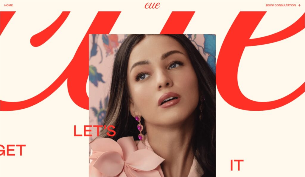
Combining a beige background with red typography adds character to a minimalist site.
Subtle use of this trend. In this case, a delicate shade of gray replaces white, while its place as the second color is taken by white. Texts are written in a dark shade of navy instead of black.
A two-color site, which approaches this idea much more boldly. The primary colors (changing background color and text) are in this case two shades of green (in the case of the portfolio changed to two other shades resulting from the project). A site designed in this way looks very bold, despite theoretically quite a classic layout.
In the case of this portfolio, the creators decided not to use white. They replaced it with a warm shade of beige, which on the first screen was combined with red. Further down the page, other colors appear, including black, but there is no classic combination of white and black on the site.
Gen-Z Stylistics
Out of the combination of several stylistics mentioned earlier, a style in itself is created, which Grzegorz Leśniewicz simply calls Gen-Z stylistics.
The Gen Z population is becoming increasingly important for marketers, who also have to adapt the style of their message to the values of this generation.
We are talking mainly about the naturalness in showing photos, the free combination of vibrant and bright colors, and the strongly expressive use of typography.
We also note the fact that sites in this style use flex solutions more often than the traditional site grid. In my opinion, we have a reference to the aesthetics of brutalism in a colorful and expressive shell of rapidly changing trends from Tik Tok.
Grzegorz Leśniewicz, Widelab
From my side, I would add a broadly understood “stylistic” from the housing estates (or maybe dustbins?) of the 90s and inspired by that time noisy photography, which this time is of course a deliberate action, and not the effect of using old equipment.
An interesting characteristic feature of projects made in this style is also the use of black frames to mark the boundaries of elements (even in combination with an additional color), using the effect of moving text sideways and simple gifs. A combination that definitely takes me on a journey to creating sites in Frontpage in IT.
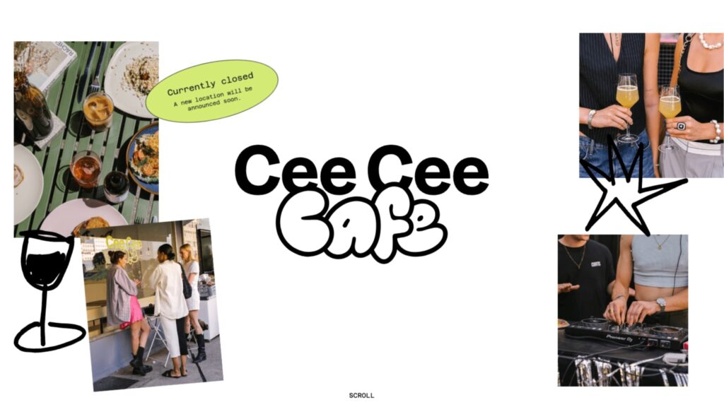
The Cee Cee Cafe site fits perfectly into the aforementioned climate by basing on simple graphic elements and combining them with pastel colors, strong lines, and natural photos.
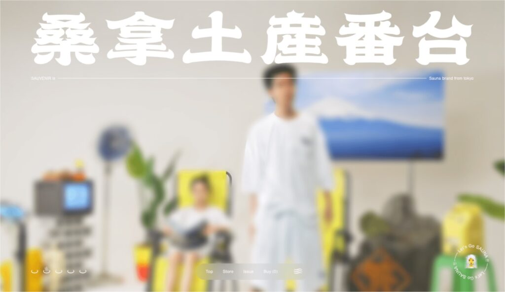
Similar techniques – lines, colors, and moving elements were also used on the website of a Japanese clothing manufacturer. The site designed in this way presents itself very boldly, despite theoretically quite a classic layout.

Aleksandra Tuliback
Founder of Grafmag magazine, co-organizer of the GrafConf conference for designers, owner of the OH! graphic studio. Studio.