Inside the 2024 European Design Awards Visuals
January 15, 2024
dotfog, EDAwards24, EDFestival24, FMMilano, GraphicDesign, Italy, VisualIdentity
In the dynamic world of design, the European Design Awards and Festival stand as a beacon of creativity, bringing together visionaries from across the continent to celebrate creative excellence. This year’s visual identity, a testament to artistic prowess and collaborative brilliance, is the result of a dynamic partnership between two Italian creative agencies – studio FM Milano and dotfog. As the architects of the awards and festival’s aesthetic narrative, these agencies have seamlessly woven together their distinctive styles, creating a visual tapestry that not only captures the essence of design but also sets the stage for a groundbreaking celebration of European ingenuity. In an exclusive interview, FM Milano and dotfog share insights into the inspiration, process, and collaborative spirit that gave life to the compelling visual identity of the 2024 European Design Awards and Festival.
Did the context of Italy in general or Naples in particular influence the visual elements of the ED Awards & Festival 2024 visual identity?
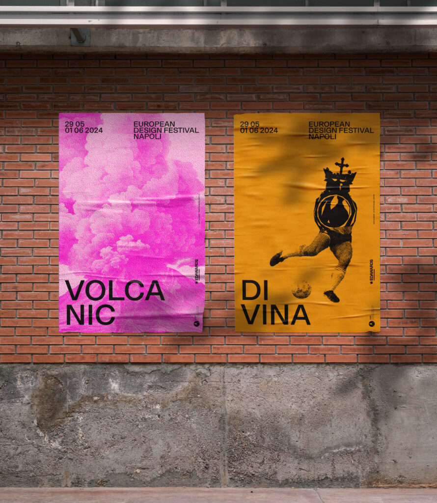
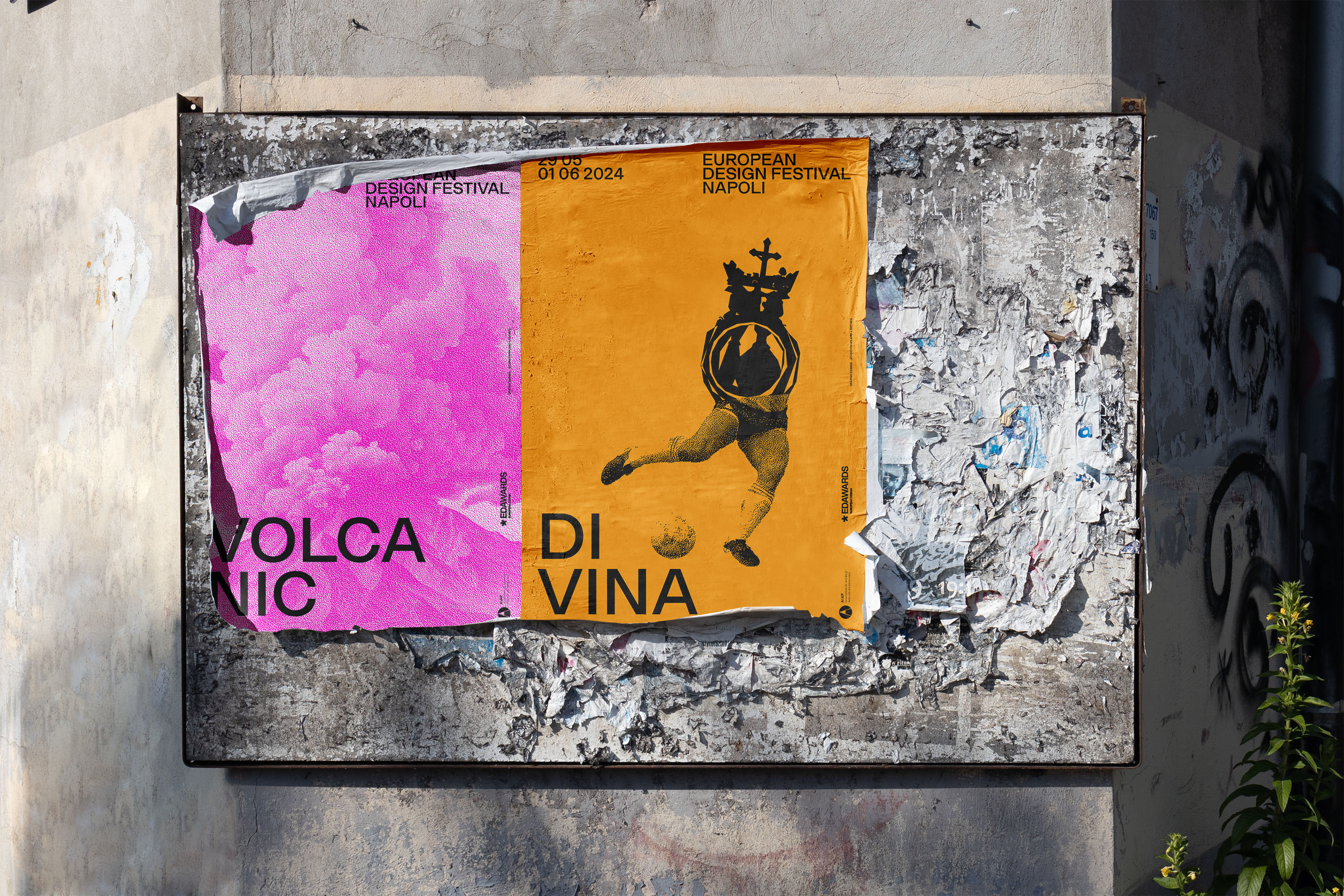
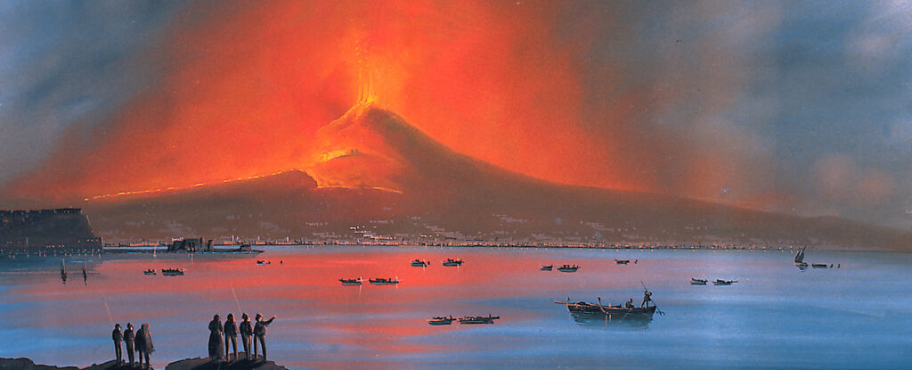
studio FM milano: Of course! It started with Marco Tortoioli’s (AIAP-Italian Association of Visual communication president) visionary idea of having a double layer, gathering us at studio FM milano and dotfog, a very talented studio based in Naples. There are two narrative levels, but they are naturally linked and continuous. Our contribution as non-Neapolitan Italians is a theatrical representation, a series of panoramas that arise from the reinterpretation of the Neapolitan Gouaches (2), created at the end of the 1700s as prêt-à-porter postcards, colorful, idealized and extreme sold to the Grand Tour (1) travelers who came in Italy from all over Europe to increase their culture and experiences. Three images that we reconstructed by entrusting artificial intelligence (3) with the task of interpreting very accurate descriptions of traditional Neapolitan views. We also gave a voice to these scenarios by using some words that could amplify both the profession of the graphic designer and the city of Naples: Volcanic, Tumultuous and Sunny. Three views, three colors and three words. dotfog studio, on the other hand, gave its vital contribution as a native and a great connoisseur of Neapolitan culture and traditions. They inhabited the identity with a system of extraordinary figures taken from local history that combines and multiplies in infinite combinations. The type face Roma Neue designed by Stefano Cremisini for CAST Foundry and the three bright colors strengthen the continuity of the two narrative levels, scenes and actors, far away and up close, outside and inside.
Can you elaborate on the symbolic significance behind the historical figures, artists, designers, and myths incorporated into the visual identity?
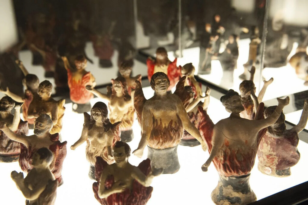
dotfog: The image system ties in with the Cult of the “Pezzentelle souls” (4), an ancient but still very much felt cult of Naples, which bypasses the boundaries of time creating a direct link of exchange between the living and the dead.
The living “adopt“ the abandoned skulls of unknown souls asking them for graces and assistance: in return, souls ask the living for prayers to shorten the pains of Purgatory toward the salvation of Heaven. Pezzentelle souls are historically represented as double figures: half-human and half-fire.
Our images are a combination of characters as well as objects from local history and culture – which generate true lay devotion to Naples. From Benedetto Croce to Maradona, from friarielli (a typical local vegetable) (5) to Neapolitan playing cards: the combinations obtained show the dualism between salvation and suffering, life and death, sacred and profane.
How did you approach the challenge of marrying these elements into infinite combinations?
dotfog: We created a system that inhabits the whole project, making it alive and always changing. The same system can then be adopted by the entire ED Awards & Festival community who will be invited to generate their own personal combinations and interact with them during the event. Images have been processed and optimized to be reproduced with craft techniques and combined endlessly. A family of combinations that can always grow!
Can you describe the collaboration process between the two creative agencies in developing this visual identity?
studio FM milano: The European Design Awards are all about gathering, sharing and learning different approaches. I think that there could not be a better occasion than this one, to collaborate with friends and other talented graphic designers that could bring together their visions. Above all thou, it’s been a fun process that brought us in unexpected directions. I think that graphic design studios should all try to collaborate more in these occasions. We enjoyed merging one into the other with simplicity, not aiming to the perfect solution but rather the most rewarding and interesting.
dotfog: The great challenge of initially blind working, in order to generate two authentic and autonomous projects to combine, was truly inspiring. Moreover, managing to put the two paths together was a game about “fitting in“ that built great richness.
Confrontation and challenge belong to the work of designers, and this put us on the line. ED A&F built a unique opportunity to work with another studio on the same project. It has been really exciting to cooperate together as a team with studio FM milano.
Were there any unique challenges or advantages to collaborating on such a project?
studio FM milano: The very essence of being a graphic designer is learning. One day we design the signage system for an airport in Qatar and the next day we design a brand identity for the Museum of Cultures in Milan. We move from a field to another regardlessly of what they represent. That’s the fun part that makes our profession unique. As graphic designers we are called to keep our minds open, without preconceptions. We research, investigate, study and interpret. Collaborating with another graphic design studio simply amplifies that process. The dialogue is the premise. Each time we begin a new project we start from zero. We might have a style of course, but that’s secondary to the method I think. I believe that our style is more in the way of thinking than in the way of expressing, even thou I’ve been told that our work is recognizable. It’s mostly in the eye of the beholder.
dotfog: It was engaging to work on the identity of an International award through the narrative of one’s own city. We tried to link Naples to ED A&F and design world in a non-trivial but effective way even for those who know little about it. We are definitely curious to find out how people will interact with the project.
In terms of design legacy, what mark do you anticipate this visual identity making in the broader design community?
studio FM milano: Well let’s not take it too seriously… we hope that this collaboration will emphasize the importance of being together as a community. There are countries in Europe where being a graphic designer is easier than in others, even two different cities within the same country might have two very different perception of our profession. If we stand united as a community we reinforce all over the knowledge of what our work is about and I’m sure we will all benefit from it.
dotfog: We hope that this project can become a way for designers to learn about the city in a genuine way. Above all, we hope they would have fun with Naples and design!
Given the studio FM Milano’s history of participating in the European Design Awards and winning prizes, how has this experience influenced the approach to creating the visual identity for this year’s awards?
Cristiano Bottino (co-founder studio FM milano): I’ve met Demetrios Fakinos the founder of the EDA in 2007 when he called us to give a lecture to the first edition that was held in Athens. We thought that his idea for this award was solid and serious. Over the years we have collected 27 prizes but above all the EDA gave us the opportunity to meet other professionals doing the same job somewhere else in Europe. For me the EDA are both an occasion to confront our work with the best graphic designers around and an occasion to travel and meet new friends, share experiences and see amazing projects. I’ve had the privilege to meet 3 of my favorite graphic designers attending to the EDA, Michel de Boer with whom I had a fabulous and unforgettable aperitif in Athens, sharing ideas and thoughts, my incomparable friend Rejane Dal Bello (author of one of the most incredible European Design Awards Identity made while she was working at studio Dumbar) and super talented Beetroot studio founder Vangelis Liakos.
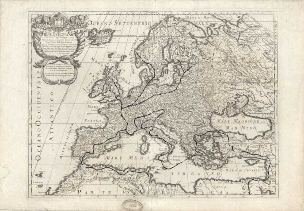
(1) Grand Tour paths (late 1700s)
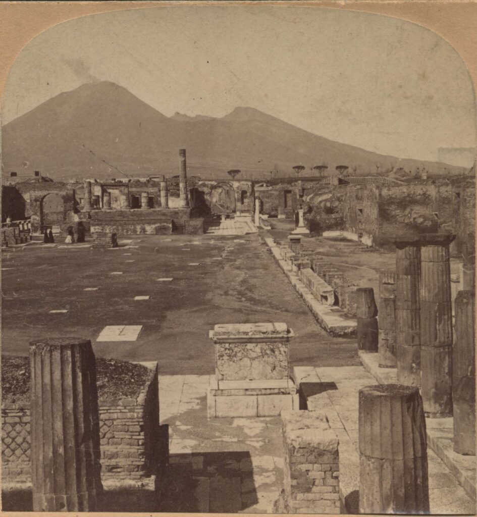
(1) A late 1800s picture of Pompei and the volcano Vesuvio in the background, a typical souvenir sold during the Grand Tour.
(2) Late 1800s Napolitan Guache
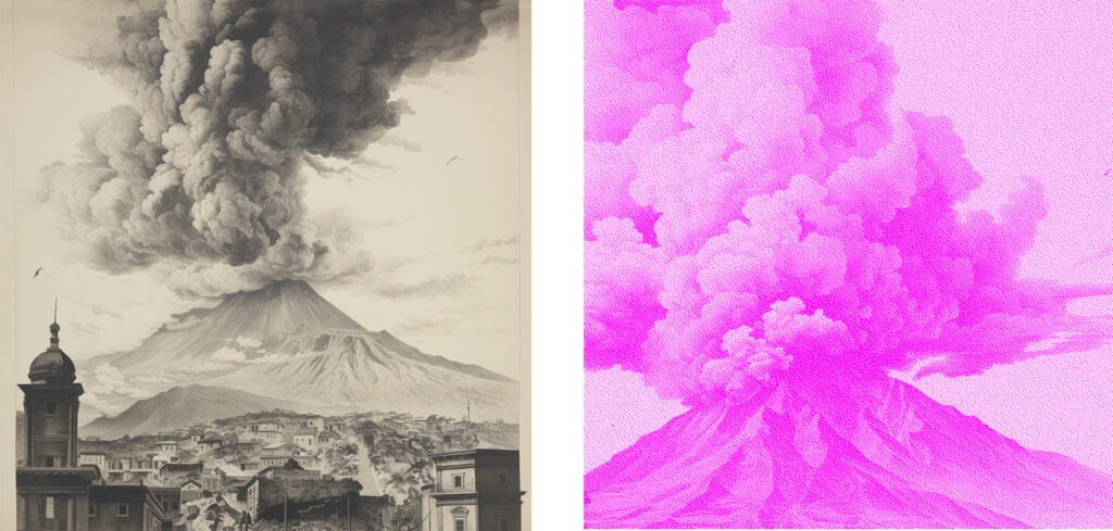
(3) AI generated panorama on the left and detail in bitmap used for the identity.
(4) Pezzentelle souls
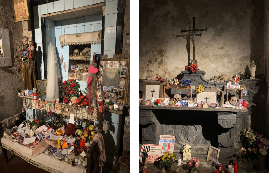
(4) The cult of Pezzentelle souls now, in the Santa Maria della Anime del Purgatorio ad Arco Church
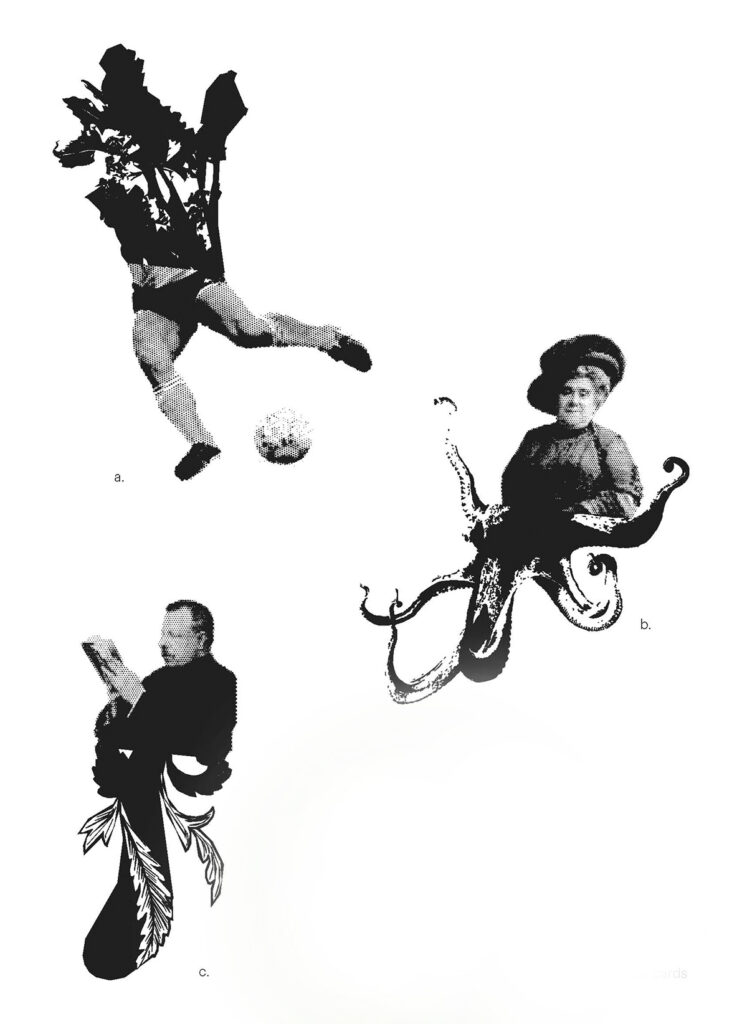
(5)Some of the system combinations: a.friarielli + Maradona, b.Matilde Serao + octopus, c.Benedetto Croce + sign of Neapolitan cards